There’s so much more to black and white than the simple removal of color. We must understand both color and tone, plus their relationship with the world of monochrome. Here are 10 tips to help you become a better black and white photographer.
1. Discover the Histogram
One of the most important and underused tools in a camera is the histogram. It is a simple graph plotting the number of pixels there at different brightnesses (luminances) in the picture. Many are daunted by histograms at first look, but they are easy to learn and use. If you want to discover more about them, then click here for an introduction.
In black and white, we are often looking for tonal separations in an image, where areas of different luminance contrast with each other. So, look for histograms with big peaks. L-, M-, N-, U-, and W-shaped histograms are typical of images that have the potential to make good black and white conversions.
2. Learn from Caravaggio and The Third Man
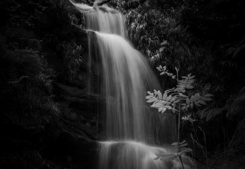
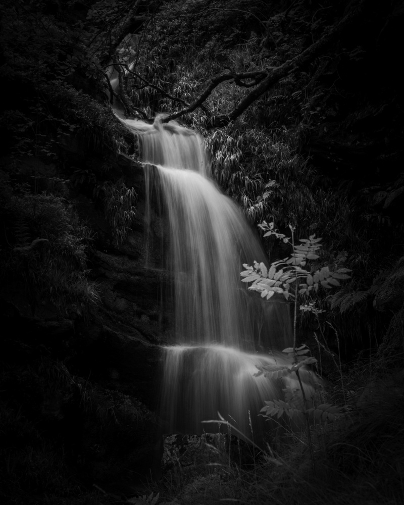
The great Baroque artist, Caravaggio, used chiaroscuro techniques in his work. This is where there is a strong contrast between dark and light, which he took to extremes in a style sometimes known as Tenebrism. These strong contrasts work particularly well in black and white photography, especially with low-key images where blacks and shadows dominate.
This technique was powerfully used in Carol Reed’s movie adaption of Graeme Green’s “The Third Man.” Robert Krasker’s cinematography emphasized the contrasting shadows and highlights. The famous scene where Orson Welles’ character, Harry Lime, is first revealed, lit in a doorway from an overhead window, plus the climax where Lime is pursued by the police in the Viennese sewers, are great examples.
Try applying similar techniques in your black and white photography. For example, look for shafts of sunlight illuminating a leaf in a forest or shining between buildings onto a person. Then, reduce the exposure so the subject and the light move into the mid-tones and the surroundings become dark or even black.
Alternatively, try lighting just your subject with a flash. Set the shutter to the camera’s flash sync speed, usually 1/200th or 1/250th second. Reduce the aperture until the entire picture is black. Then, switch on and fire the flash at the subject. You may have to change the power of the flash to avoid overexposure or use flags to stop the light from spilling onto other objects in the frame.
3. Black and White and High-Key
The reverse is possible too. If you have a predominantly bright background, by increasing the exposure, one can make dark subjects move into the mid-tones, and the bright background becomes white. This is a favorite technique of mine for shooting on a beach where the sand and the sea are bright and people are dressed in darker clothes. It would work equally well on a sun-drenched street. Add two to three stops of extra exposure to the image and the landscape becomes white. Then, in post-processing, reduce the shadows and blacks to make the subject stand out. If necessary, increase the exposure, whites, and highlights. It may need additional contrast too.
4. Switch Your Camera to Black and White
If you use a mirrorless camera, by switching over to black and white, one can preview through the viewfinder how the images will appear. With a DSLR, one would have to look at the image after shooting. This is a great way of learning to see in black and white, finding out what works and what doesn’t.
If you shoot raw, all the color detail will still be stored and accessible by the development software. However, if you are a JPEG shooter, then you will only have the black and white version of the image. If you haven’t already, now might be a good time to switch your camera over to shooting raw or raw plus JPEG and learn the skills of post-processing.
Although it is subjective, different cameras produce different black and white JPEG results, and some are better than others. Some I find meh, but I particularly like the monochrome JPEGs produced by Olympus and Fujifilm cameras.
5. Buy Some Cheap Colored Filters
To understand how colored filters work, we must know a bit about complementary colors. If you remember mixing paints at school, then you’ll recall there are three primary colors: red, blue, and yellow. Mixing any two of those colors, we get the secondary colors. The complementary color of the secondary color is that which is not part of its composition, i.e.:
Red + Yellow = Orange: The complementary color is blue, as it is not part of the orange.
Yellow + Blue = Green: The complementary color is red, as it is not part of the green.
Blue + Red = Purple: The complementary color is yellow, as it is not part of purple.
That is a very simplified explanation, but it’s a good place to start.
In photography, a colored filter will brighten the same color and darken the complementary. So, an orange filter will darken a blue sky and water and brighten an orange lifebelt. Red filters darken green foliage and lighten poppies, stop signs, etc.
Although common for film photography, not everyone uses colored filters now. That’s because filters to change the luminosity of the original colors are now available in digital developing software. However, if you use these, adjust them gently. Large differences in the luminosity of adjacent colors can cause unwanted artifacts in your final image.
Online shops stock cheap, plastic filters. Although I wouldn’t recommend these for your best shots, they are a great way of discovering how colors work in black and white. They can be fun for creating lo-fi images too. Nevertheless, you may ultimately want to invest in some better-quality glass ones, as they will give you results otherwise unavailable to other black and white photographers.
6. Compose with Tones
The basic guidelines for composition are the same as in color photography. However, in color photography, we choose to place bright and dark colors in the frame to draw the viewer into the picture. With monochrome we do the same, but with bright and dark tones. For example, we might choose a dark foreground with mid-tone leading lines to a subject that’s contrasted against a bright horizon. Alternatively, we could divide our frame into areas of different tones that help us to concentrate on the main subject. See also part 10 below.
7. Embrace Abstract
Abstract photography lends itself well to black and white. Look for shapes not only of objects but those formed by shadows or projected light. Get up close, tilt your camera, show the world in ways you would not usually see it. Practicing abstract photography helps us to tune our eye to using abstraction as part of other photographic genres.
8. Be Minimalist and Clear Out Clutter
The human eye likes simplicity. Black and white photography does too. The big advantages of getting up close are the removal of extraneous clutter from the frame, hiding unwanted elements with the restricted frame, and the shallow depth of field that proximity brings. What we exclude from the frame is as important that what we include.
9. Find the Software That Gives the Results You Like
This is subjective: I don’t like the black and white results in Lightroom or Affinity. If you like them, I won’t argue with that, but I make no apologies for not finding the results appealing. I do have a particular fondness for three programs for my black and white work.
Firstly is my camera’s own software. When I upload black and white raw files to Lightroom, although it automatically applies the “Camera Natural B&W” profile, it doesn’t hold a candle to what I saw in the camera. However, using my camera brand’s software, I can exactly replicate what the camera produced. I then tweak that. I can already hear the purists shouting at me that the camera’s JPEG results are not what we should be striving to achieve, but I like the results that the clever technician programmed into my Olympus OM-D E-M1s, so why shouldn’t I enjoy them? My customers do.
Secondly, On1 Photo Raw. The combination of its adjustable presets with the various adjustment layers, especially dynamic contrast, gives splendid results that are superior to Lightroom and Affinity’s. Again, this is my opinion, and it’s okay if you disagree with me.
Thirdly, is, of course, Nik Silver Efex Pro. This is my usual go-to software for most of my black and white work and well worth the investment in money and learning time.
10. Learn the Adams-Archer System
You can learn a lot from studying black and white photographs of the masters. I find myself dwelling over the monochrome images far longer than I do color.
To my mind, the king of black and white landscape photography is still Ansel Adams. He and his friend, Fred Archer, devised a system of determining the optimal exposure for both shooting film and developing it.
Their system involved arranging the scene according to how the photographer visualized the final image. Adams would split a landscape into 11 zones of differing brightness, with 0 equaling black and X (they used the Roman numerals, so X is 10) being white. He would then expose the shot so that the brightness of the image’s different components would correspond with the correct zone.
This is a modified list of each of the zones, giving an approximation of their brightnesses. Each zone is one stop, or double the brightness, of the previous zone.
0. Pure Black. No other tones or texture can be seen.
I. Near black. There is slight tonality, but no texture is visible.
II. Textured black. This is the darkest part of the image in which very slight detail is recorded.
III. Darker shadows. Cloths and similar materials. Texture is visible.
IV. Shadows. Black African skin. Foliage, dark stone, or landscape shadows. A good, detailed texture is visible.
V. Mid gray. Clear skies looking away from the sun towards the poles, dark Mediterranean skin, weathered wood, gray pavement.
VI. Light. Caucasian skin, light stone, strong shadows on the snow in sunlit landscapes.
VII. Very light. Palest skin, weaker shadows on the snow.
VIII. Lightest tone with texture still visible. Snow should be exposed to this level to still show its textures.
IX. Slight tone without texture, such as glaringly bright snow. No texture is visible.
X. Pure white. Light sources and specular reflections.
They then chose the brightness of different areas to draw one’s eye into the heart of the image, initially by composing the shot, and then in the development stage.
Let’s See Your Black and White Images
Are you a fan of monochrome? If so, let’s see some of your results in the comments. If you are an experienced black and white photographer, what other hints would you give to others?
This was a very brief introduction to the world of black and white, and there are volumes written about it. If you have any questions, please do ask.