Nail white balance in Lightroom every time with these simple steps and techniques you can use on any photograph.
Capturing photographs with an accurate white balance can be quite tricky. A mixture of light conditions, weather, and colors of other surrounding environments all impact how the white balance is perceived in a shot. Short of taking out a gray card or a color swatch every time you head out to shoot, it can be almost impossible to nail the perfect white balance every time. However, if there’s a will, there’s a way. Luckily, if you have Lightroom Classic, you can nail the colors quickly every time. You may not even need any color theory knowledge at all; just a couple of clicks, and you could be done. So, let’s take a look at some of the simplest and quickest ways to get perfect white balance in your photos for excellent results in every shot.
Auto White Balance
There was a time you’d hit the auto button on your image-editing software, and it would “correct” the photo to within an inch of its life, spoiling delicate lighting or ramping up colors. Luckily, Adobe has done a great job in Lightroom Classic, where auto settings now intelligently read the scene and make more appropriate changes.
Head to the Develop module and find the white balance section in the top-right toolbar pane, and use the white balance (WB) drop-down menu to select Auto. The Auto option in the white balance options does a surprisingly good job at getting accurate results. It’s perfect for editors that aren’t sure how to balance the colors in a photo and makes a good jumping-off point for those that want an almost neutral look without having to spend too long pushing the sliders back and forth. But it’s a rough approximation of what Lightroom thinks the white balance should be and shouldn’t be relied upon if you’re trying to develop your own style.
Daylight White Balance
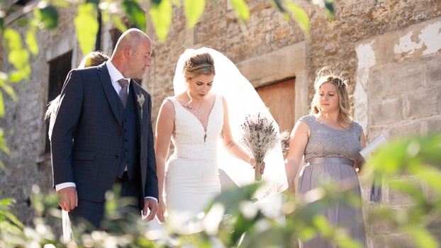
Move to another preset that matches the lighting conditions from the scene, and you might be surprised how often the white balance doesn’t quite match up. In my portrait photograph, I have an outdoor scene with all my subjects backlit as they walk down the cobbled limestone alley. Light fills the bride’s dress and veil from behind, and the foreground foliage is brightly lit. The sunlight is also bouncing around the warm stone and reflecting into their faces and clothes.
Naturally, putting this shot into a daylight white balance might seem like the best option because the scene is lit with daylight. But in this case, because the lighting is quite extreme and the scene so complex, it actually feels a little too cool. The lower color temperature of the white balance preset takes a lot of the mood from the shot, even though it’s technically correct in theory. So, what do you do when the presets don’t work out?
Eyedropper Tool
If you’re struggling to get a white balance that looks right in your photo, it might be time to take matters into your own hands. The quickest and easiest way to get the color balance you want is to use the eyedropper tool (known in Lightroom Classic as the White Balance Selector, keyboard shortcut W). With the eyedropper selected, run the cursor over the image. The end of the eyedropper is the spot the tool will select from. It will also display a useful window with a 5×5 grid that shows a zoomed-in look at the pixels on and immediately surrounding where the eyedropper rests.
The trick with this technique is to find a patch of pure gray or white that hasn’t been clipped from which to sample. View how the tool will affect the white balance by looking at the navigator in the top left of the window before committing. Once you’re happy, click on the area you want to set as the target neutral, and let Lightroom take care of the rest. Within an instant, the white balance should correct. However, even with this method, it’s difficult to get the look right, as the sample area may be slightly in shade or influenced by reflected light from other areas in the environment. For a more refined approach, you may have to use the sliders.
Refine White Balance
After using a preset or the white balance selector, it’s a good idea to take things one last step further and customize the white balance with incremental adjustments using the temperature and tint sliders. Usefully, the sliders are colored and demonstrate the type of effect they’ll be making to the image. For those who are colorblind, the temp slider goes from blue to yellow (left to right) and the tint slider is green to magenta (left to right also).
As you can see in my example, the temperature slider is way up at 6,750, which I would argue is normally far too high for an outdoor portrait such as this. But due to the warm stone surrounding the subjects, the green foliage in the foreground, and the placement of the sun, this is actually the most accurate setting that matches the scene when I was there. However, the white balance selector I used in the previous step did add a little too much magenta, so I turned the tint slider down from +4 to 0. This introduced more green in the shot and gave everything a more natural tone.
Before and After
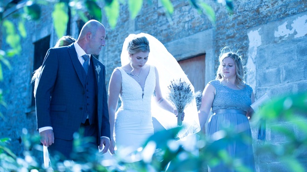
As you can see from the before and after above, getting the right white balance is crucial to making or breaking a photograph. It could be as simple as using a preset, letting Lightroom automatically adjust things for you, or using a few simple steps to manually adjust the colors so that everything looks just right. Remember, white balance is both about being accurate and stylistic, so don’t head for a specific setting just because it’s theoretically correct. Be aware of the mood in the photo, and if you took the shot, try to recall how it felt when you were there and match the emotion with the colors.